Wednesday, 13 April 2011

Music magazine research and proposal

Research!

It is important when creating a magazine that you make sure you are designing it for the right targeted audience, if you do not it will not be a successful magazine. This is why you should conduct research into where there are gaps in the market for a different type of media product, offering something different, challenging media conventions.
From my own personal experience as being a youth I noticed that a lot of music comes from an indie culture, therefore I thought that this is something popular creating a magazine based on this genre would be perfect, as it would target a lot of the younger generation. However I wanted to challenge some media conventions with my media product, therefore I wanted to search the internet to see if there was a gap in the market for me to produce a completely indie genre music magazine.
I searched google for indie music magazines this is the result I found: 


The second result down was a website for a magazine called ‘Crud’ this was a magazine offering the genre of indie music and alternative music.


When I searched the website it was not very informative, and did not give me a lot of information on the genre of music it was claiming to represent.

The second link I clicked on took me to an online magazine called avenue 61, having the genre of indie and alternative music the same as the previous magazine.


This website was quite informative and gave information of gigs and festivals, this is something that youths would be interested in. from looking at this website I would suggest that it would be targeted at 16-19 year olds, this is the target audience I would like to look into for my own music magazine.

Other magazines such as NME also have aspects of indie music involved in them, however I did not find one magazine that was purely based on indie genre. Therefore I feel that there is a gap in the market for this type of magazine, with the target audience of 16-19 year olds.

A lot of the charts are filled with indie music such as, Nero, Adele, Mumford and Sons, Example etc. therefore this means that I wide audience listen to this music on a daily basis, giving me a huge target audience to work with. Also a lot of festivals headline a lot of indie acts, for example, IOW 2011 is headlining Kings of Leon and tickets for this festival sold out within a matter of a couple of days, showing that this is a popular genre.
The title of the magazine is the main focus point of any music magazine, as this is the first thing that you will see when looking at the page. This means it is important that it captures the audiences eye. My idea for the title is dropbeats, the reason I have chosen this name is because it is relevant to music, and I think that this name is memorable. It has the connotation that beats are dropping from the pages of my magazine creating the music my audience is reading about.
A good buzz word or phrase is the best way to illustrate that your magazine is better than its main competitors. For example the buzz phrase for Q magazine is ‘Britain’s Biggest Music Magazine’ this line conveys to its audience that this magazine is the best in the country so therefore why go anywhere else for a music magazine when you can have the best. This buzz phrase used alliteration to allure its audience. I think that for my own music magazine I will use the same idea to suggest that my magazine is the best indie music magazine in Britain.
The main image is the biggest focus of the whole magazine, so you would expect to have an image that will capture the audiences eye as well as relating to the genre and style of the magazine. For my own media product I would like to have either a band or an artist to be my main image, the image will have to make full eye contact with the target readers, grabbing there attention and involving them in the magazine. I want to have an image that is fun, as I think this will help with the tone and genre of my magazine. 
For my colour scheme I would like colours that you can relate to the genre, which would be a mixture of dark and bright tones, so black would be a good colour, but to contrast red would stand out.
As my target audience is within the teenager generation I feel that a good reasonable price would service. As in the current government state, not all teens can get jobs and earn money; therefore if this magazine were priced too high, it would not be affordable of accessible.
I have noticed that most successful music magazines such as Kerrang, Q, NME etc are released every month, however I feel that the music business is too large to just cover over month periods of time therefore I would like my magazine to be produced fortnightly, giving my target audience all the information they need about the indie music that is happening now, covering the current. 


7 point evaluation 2

Check out this SlideShare Presentation:

Friday, 8 April 2011

Images used!

This is the image i took for the front page of my magazine. i chose this image because she has good eye contact with the reader and therefore becomes more attractive to an audience.
this is one of the images that i used for my double page spread, i chose this background and for her to be on a bed because i thought it would convey her personality by the surroundings that she is in.
this image shows a fun loving person, however i did not use this image because i thought that for a 17 year old girl it did not look mature enough.
this one shows the meanings of the image above however in a more sophisticated way.


Other images- not used


questionairre

For my magazine i did some audience research about downloading music, so i could have anarticle in my magazine and help me relate this magazine to those who will enjoy it.

I gave 12 people this questionnaire:

Questionnaire

Do you download music?

Frequently

Often

Not at all

What do you use to download music?


Do you think downloading music increases the price of albums and why?


Do you prefer buying CD’s or Downloading and why?


When you download is it single tracks or albums?


When downloading albums do you also download the album artwork? If yes why?


Have you ever-downloaded music illegally? If yes why?


What is your favourite type of music to listen to?
Rock                        Pop                        Indie                        House                        Dance/Trance
R&B                         Other
(if other please state below)


Are you more likely to download or buy an album after going to a gig/concert?


How often do you listen to music?

Frequently

Often

Hardly ever

Never

Where do you hear music the most?

Radio                        TV (music channels)                        concerts/gigs                        other

(If other state below)


everyone i asked listens to music frequently, therefore this means that they enjoy music a lot. Every one of them said that they download there music rather than buy an album, as it is quicker faster and free, and a majority all admitted to downloading music illegally. however when i asked if they thought that the amount of illegal downloads was affecting the prices of albums only 2 out of the 12 said they thought that this was the case. they thought that because they did not buy albums it does not affect them.
I asked where they downloaded there music from some of the sites were, youtube converter, frostwire, itunes and the pirate bay. the majority said they used youtube converter, this is a free and legal way to download music from youtube turning the videos into mp3's.
when asked if when they downloaded weather they downloaded the album or just single tracks, and the majority claimed to only download single tracks.
Out of the 12 people that i asked download the album artwork as well as the song/s, because they think i looks better when it comes up on there ipods etc.
I found out that the music they listen to the most is R&B, then pop and then indie and dance/trance music.
when going to see a concert/gig 11 out of the 12 said that they would either buy or download the music they had heard, however 8 of that 11 said they were more likely to download the music.
finally i asked where they thought they listened to music the most, the majority said that when they hear music the most is when it's on the radio, then it would be TV (music channels).

From this questionnaire i found out that a majority of young people would rather download music than buy the album because it is cheaper or free and it is quicker to download in the comfort of your home than go out and buy all the music separately and risk having singles on the album you don't like, rather than being selective about the music you with to listen to.

Wednesday, 12 January 2011

Contents page of music magazine

This is my Contents page for my music magazine. here i have tried to keep it in keeping with the rest of the magazine by having the logo at the top of the page.
featured and regulars lets the reader know what it is they can expect from this magazine and what sort of things they will receive every week.
the pictures relate to the stories and i have given page numbers so if this is a story they want to read straight away then they can go straight to it. i have put the most interesting stories in picture so as to catch the readers eye.


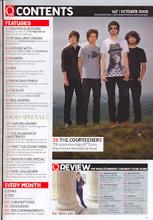
after creating my first attempt of a contents page for my own music magazine i came to realise that it was not to the professional standard it could be. therefore i took an example of the music magazine Q and took the structure and added my own media product to it.

Q magazine
this is the contents page i then came up with. i stuck with the same colour schemes as i felt that they stood out and were recognisable colours. the image is large and is followed by a caption to explain to    readers what the article is therefore making the image make sense. in my contents page i have got feature articles which are pages that our specific to this months magazine. and every month articles which will appear in every issue of the magazine. 

this is the final contents page. i added a picture in the bottom right hand corner. this image looks like a paparazzi shot so therefore fits in well with magazines and celebs.


Double page spread of music magazine

Here is the image for my double page spread i have made the image heavily edited because i feel that it gives an edge to my artist. The guitar is in the image as it conveys what my artist is about.


Here i have added the drop beats logo so it makes it clear to all of my readers that they are reading drop beats and they know that we are behind it.


Here i have started to add in the interview, i have given a short introduction and then asked the questions. Each question is in bold  to show the difference between the question and answer.


This Is the rest of my interview i have added the picture of the guitar as this artist is passionate about it and this is shown through her interview.
Also i have added the logo at the end f the interview as i feel this is more professional.


this is the first page of the double page spread. page is simple and clearly shows who this interview will be about. in a lot of the music magazines i have looked at the interviews and they have been quite short and to the point with large images usually covering one whole page. this is what i have tried to do here.


this is the second page of my double page spread, as i said before alot of music magazines are done in this style. the little quote next to the image shows part of what is in the content of the interview and i feel that this is something that looks professional.
this is the final first page of the double page spread, i changed the image as i felt that the image before was not sophisticated for a 17 year old girl, this then meant that i had to change the colour of the font to be visible over the image.

Masthead and Practise Music Magazine

This is the start of my Music magazine front cover, the first thing I looked at was doing the masthead, as this is most likely to be the first thing that a reader will notice when purchasing a new magazine. I spent time on this coming up with different fonts, colours, gradients, until I found a title that I felt would be eye catching and relevant to the target age of around 16-21.
The first thing I had to decide before choosing what I wanted my mast head to look like was the name of my new magazine. I then came up with the name Drop Beats, I thought that this name was relevant as it links to music. And I feel that it is a catchy title for a music magazine.


Here I have produced some ideas for my masthead, first I just tried the title in Times Regular and I felt that for a magazine this didn't have enough edge to it.
Next I tried it in the font Marker Felt Wide, I thought that this font was good as it stood out and was different which meant that it would be unique. For the colour I just tried a dark tirquise as it was very clear and easy to read.
This next one I left it the same font and colour but I added a shadow behind as this gives the heading depth. I left the 'o' in drop so that I could then get a small picture of a CD and photo shop it as the o, so that it would make sure that when people saw this magazine straight away that it was all about music. However I felt that this did not work and looked unprofessional.
The final masthead I decided on was in the same font as before however I liked the idea of putting one of the letters as something related to music so that it made it clear what my magazine was all about. So therefore instead of the b in beats I replaced it with a semiquaver and flipped it so it was the opposite way. I feel that this gave my masthead a very unique look.

Here I have tested out colours for my masthead to get a feel for what I thought would work.


Then I moved on to do a mock up of a front cover using my new masthead to get a feel for what it would be like on the cover. For this I chose the orange title as I felt it was bright and would capture the eye. I took an image of Panic At The Disco from google and placed that as my main image as they are a popular indie/rock band. I left the background white as my colour scheme was orange black and white. The main cover line was in times regular font as this makes it clear. 'Panic At' was in white and then 'The Disco' was in orange and Times bold as this made it stand out.
Along the top of this mock up I added the names of some of the latest artists they would be featured in the magazine. This way that meant that when someone saw the cover they would know straight away what they could expect from this music magazine and decide if it was for them.

Front cover of Music Magazine

This is my progress through the font cover of my new music magazine 'Drop Beats'. In my last post you saw that I was decided on a masthead, however I thought that the font I had chosen didn't work for the type of magazine I wanted to produce. So therefore I changed the front to ... and the colour to a blue/purple. Because as this magazine is about R'n'B music I felt it needed a cool and edgy look, and I feel that this font and colour combination achieved that. I also added a heavy shadow behind the masthead in black to make the words stand out of the font page.

Along the top of this cover I kept the idea of putting the names of the latest artists and bands that would be featured in this fortnights magazine. All the artists/bands I have chosen reflect the tone of the magazine and will interpret what kinds of readers it will attract.
I decided that as the masthead was quite bold and out there that I wanted the rest of the writing to be in the font either Times Regular or Bold, as I feel this creates a good contrast. The first cover line under the title is 'The start of... 2010' This is telling my reader that this issue will be all about going into 2010 and what is coming up. the three full stops add suspense when reading so you want to know what is coming next.


Firstly I decided that my colour scheme would be blue/purple the same as the masthead, black and red as I feel these colours mix well together and give colour when needed.
the next cover line says 'the best up and coming artists of this year' this will attract the reader as it give a good inside into music for the year to come, and if you are a big music fan you will be very interested in new artists. I put 'the best' in big bold red lettering as this instantly draws you in that this magazine will provide you with the best. I chose red as this is a very outstanding colour and catches the eye easily.
secondly I have added a cover line about two very influential artists 'Florence and Dizzee Rascal The Britt-Performance Interview' this will interest viewers as these artists have collaborated together and the Britt-performance was a big event that was exciting, and I think that my readers would find it interesting to find out about these artists as a duo and what they have coming up, the and sign added in red to stand out and show the reader that these two artists are combined. All these cover lines are giving links and clues as to what you will find inside.

Here I just made a few subtle changes that I think will make all the difference for the final product. Firstly I changed the colour of the and sign because I felt that it did not need to be outstanding as it is not the most important thing on the page that I would like my readers to look at. Secondly under 'Dizzee Rascal' in big bold red lettering I have used a buzz word 'Exclusive' this is because I want my readers to know that this is the only magazine that will give you this informations which then makes my magazine the most original.


For this development to my cover i have added the name of my artist featured in this magazine 'The high life of... Agnes Dean' I have kept 'the high life' in red i think this is a good line as it conveys to my readers that she is top of her game and a good artist to look out for. Then for 'Agnes Dean' I used the same colour as the masthead and a different font as I feel that this makes it contrast to the rest of my cover.
finally i have added the main image, this image i took shows a fun girl, who i feel my readers will be able to relate to easily. I wanted to feature the guitar and amp in this image as I think it gives the reader a chance to see what sort of artist she is.


Since changing the style and colour schemes of my music magazine contents page i decided that it would look professional to change the front page, as this is the most important part of the magazine and is the selling point. i took my structure from the front cover of Q magazine.

Q magazine


this is my final front cover for my own music magazine, the background is light and represents the season of spring and the beginning of the year. the tag line at the top of my page suggests that this will be the best magazine around for indie music. all the tag lines down the sides show all the indie stars of 2011.
the main image is good as it has eye contact with the audience this means that readers will feel conected and therefore be more likely to purchase the magazine.


on this final front page i made one simple change and that is the colour of 'Agnes Dean' this is because in white it is more visible and stands out,  and is eye catching.

Friday, 7 January 2011

Student Magazine

This is my Student magazine, the picture i used is of a fellow student. i have placed him in front of the animals because it gives an interesting look and he's facial expression and hand gestures shows that he is happy to be there. i feel that this image will catch the readers eye as the colours are bright and the scenery is nice.
     The Masthead of my magazine is 'THE STUDENT' this specifically reaches to a certain audience straight away. so this makes it an appealing name. i have chosen a black bold font in capitals as this really stands out on the page. by adding the blue it adds colour to the page and therefore attractiveness.


On this second front page i have made the masthead bigger to cover the whole top portion of the page, this means that it will be noticed from a further distance. 
     i have also added a cover line which says 'This guy loved the opportunity to be caged up with the animals, will you too?'
This invites the reader in as it is a direct question. this will encourage them to turn the pages and read more about it inside. 


On this third front page i have added a main cover line and two other cover lines and also a selling line. i have put the selling line underneath the masthead as this is a little extra into what goes on in this magazine and what to expect from it. It states 'Music, Fashion, Animals, Motors, And much much more!' this is written in black bold capitals so as to catch the eye and it is very clear. This tells the readers that there is something for everyone, no matter what your into. the exclamation mark conveys excitment of what the 'much much more!' could be, this will intregue the reader.
     The main cover line is placed underneath the main image this is to portray that the two are related. its reads 'caged ip! student charity stunt!!' This is written in capitals, and in a bold fun font, this cover line is blue as it is in tone with the colour scheme and the masthead. caged up it a bigger font than the rest of the cover line this is because these words evoke interest from a reader and they have to pick up the magazine to read what its really about. The use of exclamation marks here conveys something exciting and possibly dangerous. The last cover line says 'south downs college backs student band in competitive competition!' this is showing that the college is interested in its students skills and hobbies and will give support.